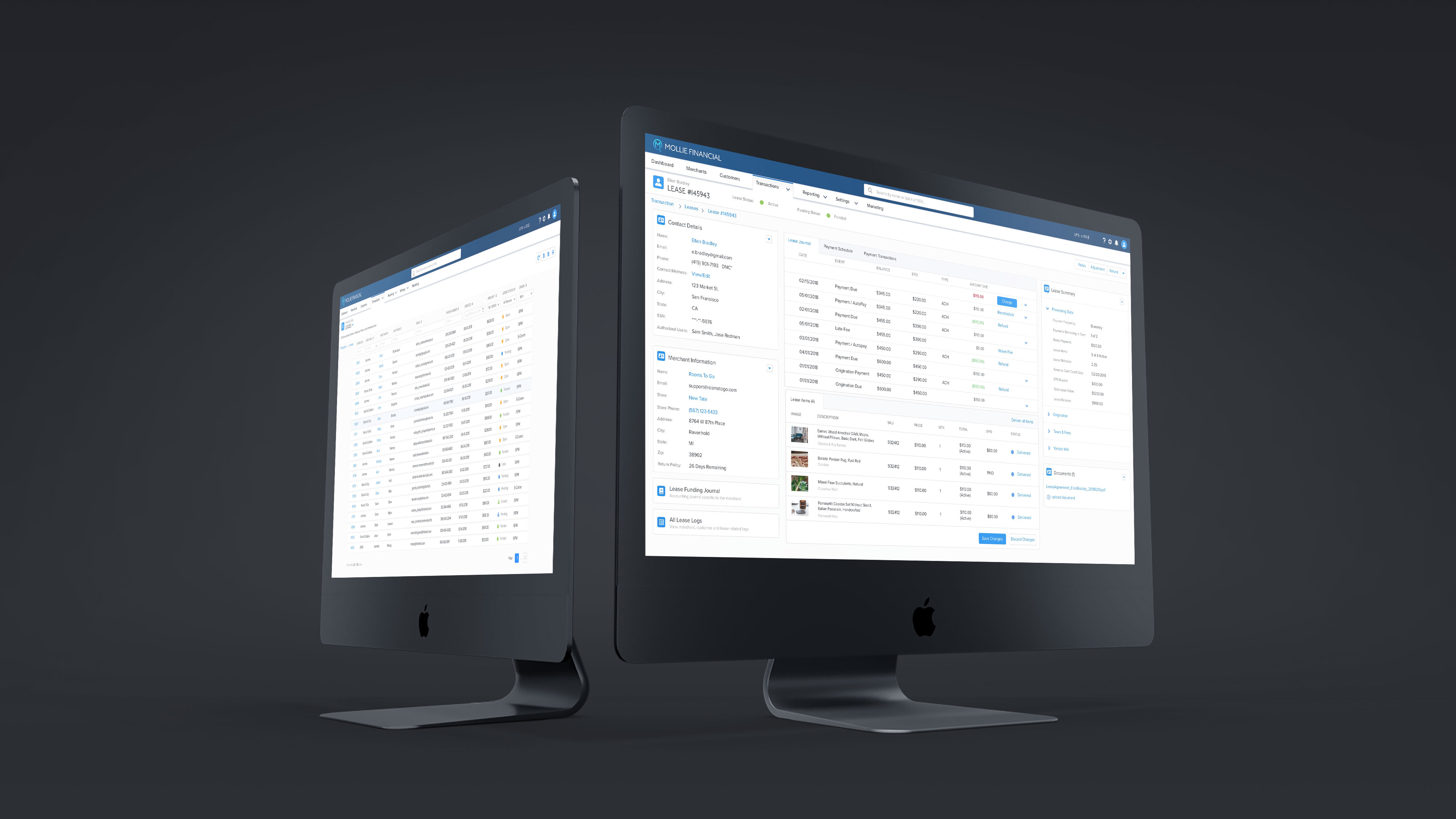
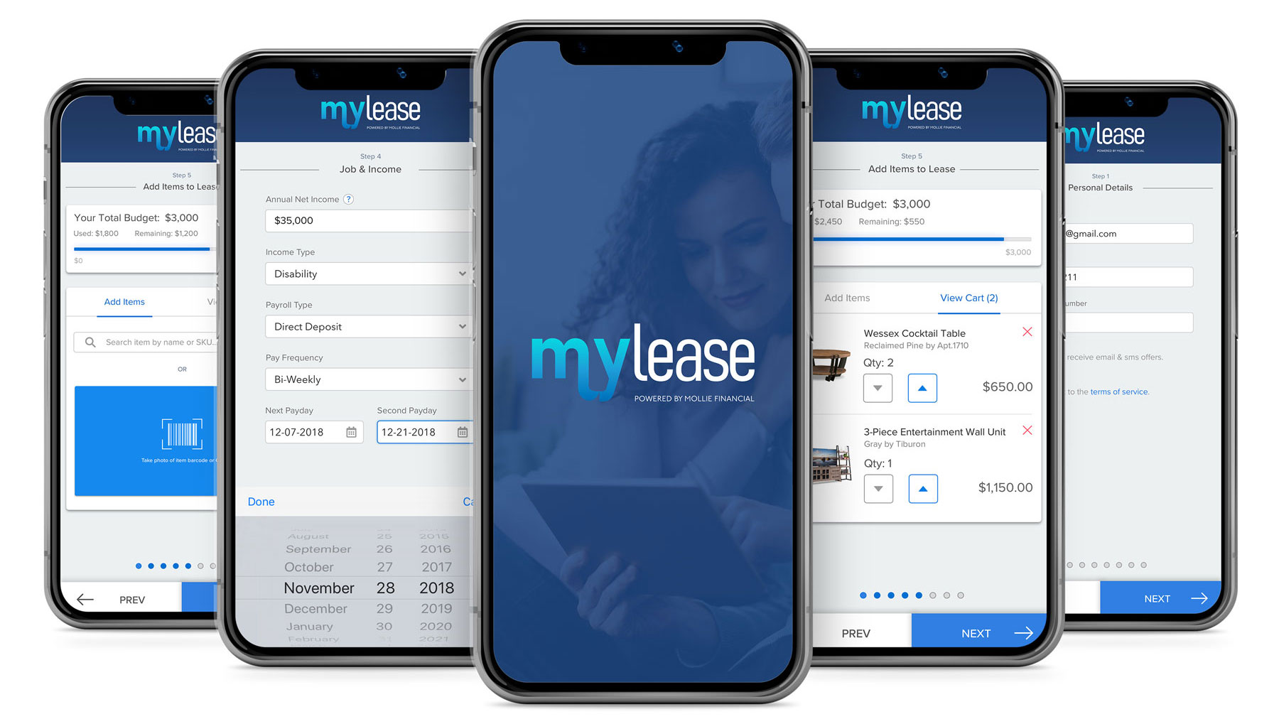
Mylease - Mobile Application
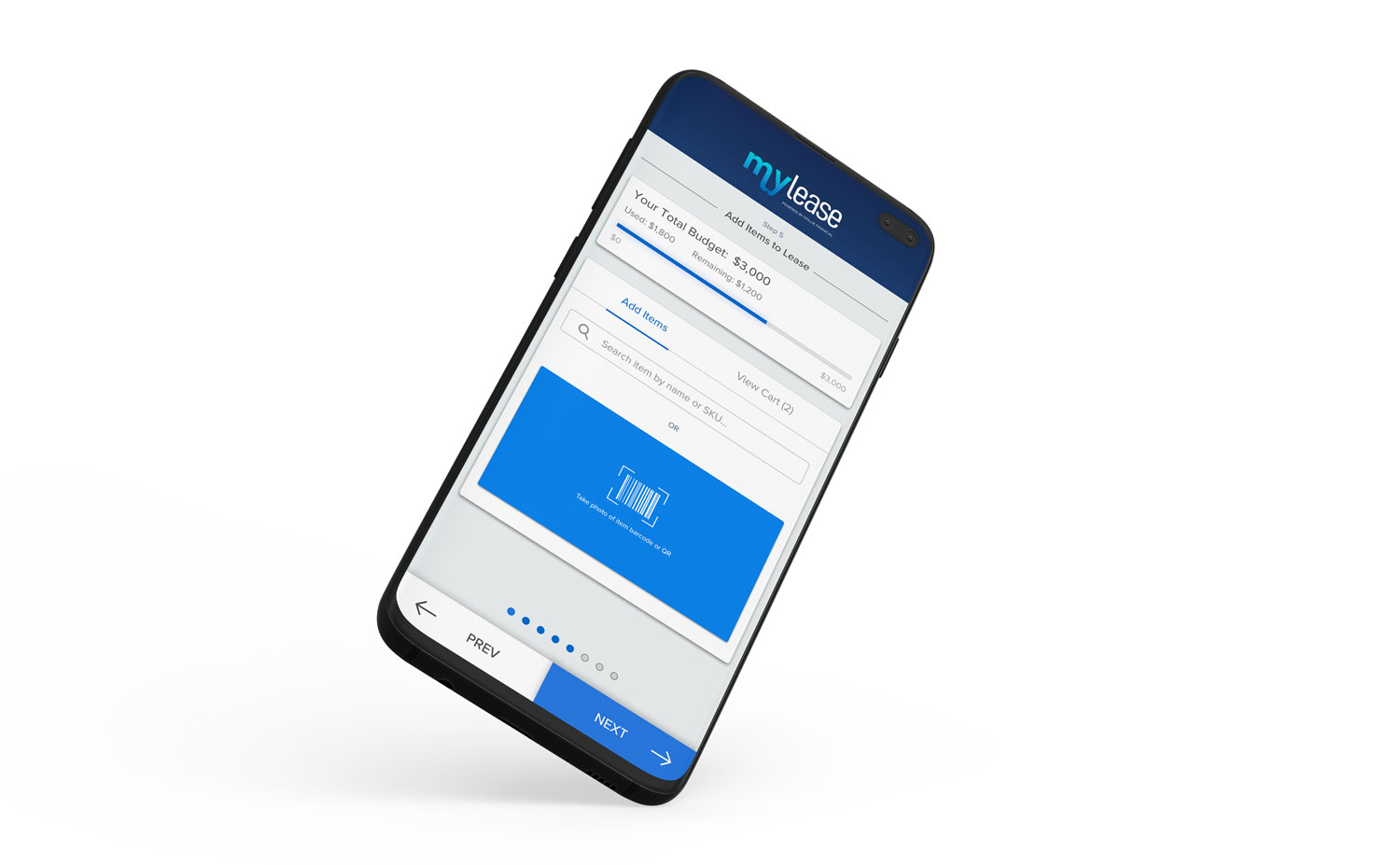
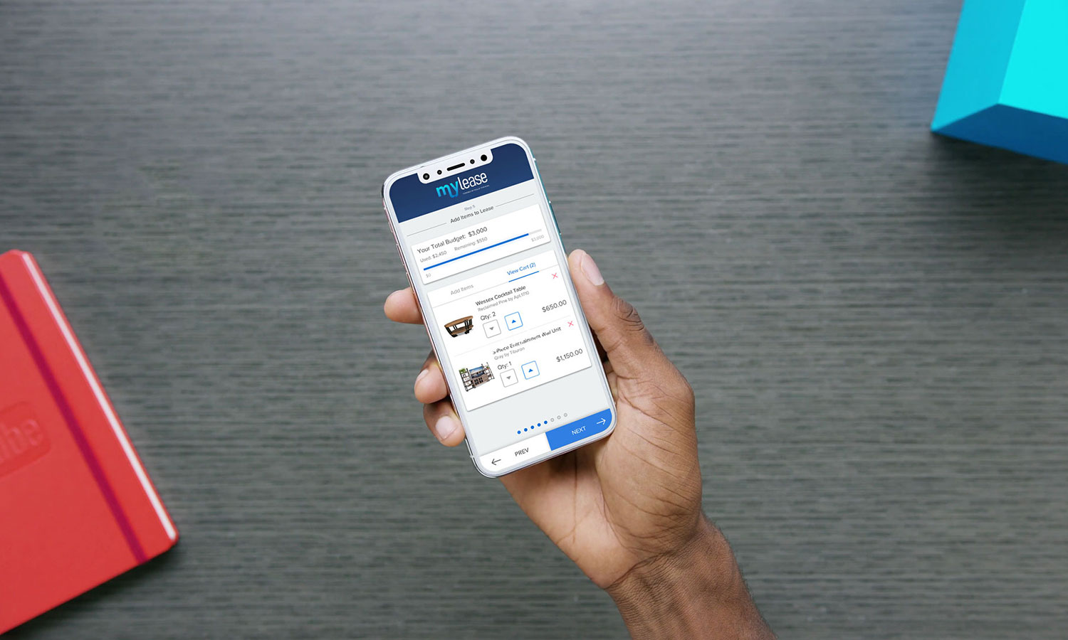
The Mylease ISPM (In-Store Purchase Module) is a mobile web application in which participating retailers could use to facilitate a financing solution to their customers. The goal of this project was to improve the usability and visual aesthetic of the existing application.
Role: UI/UX Designer
Tools: Sketch, Photoshop, Illustrator, After Effects, Invision, Marvel, Principle
Click here to view the prototype
Research
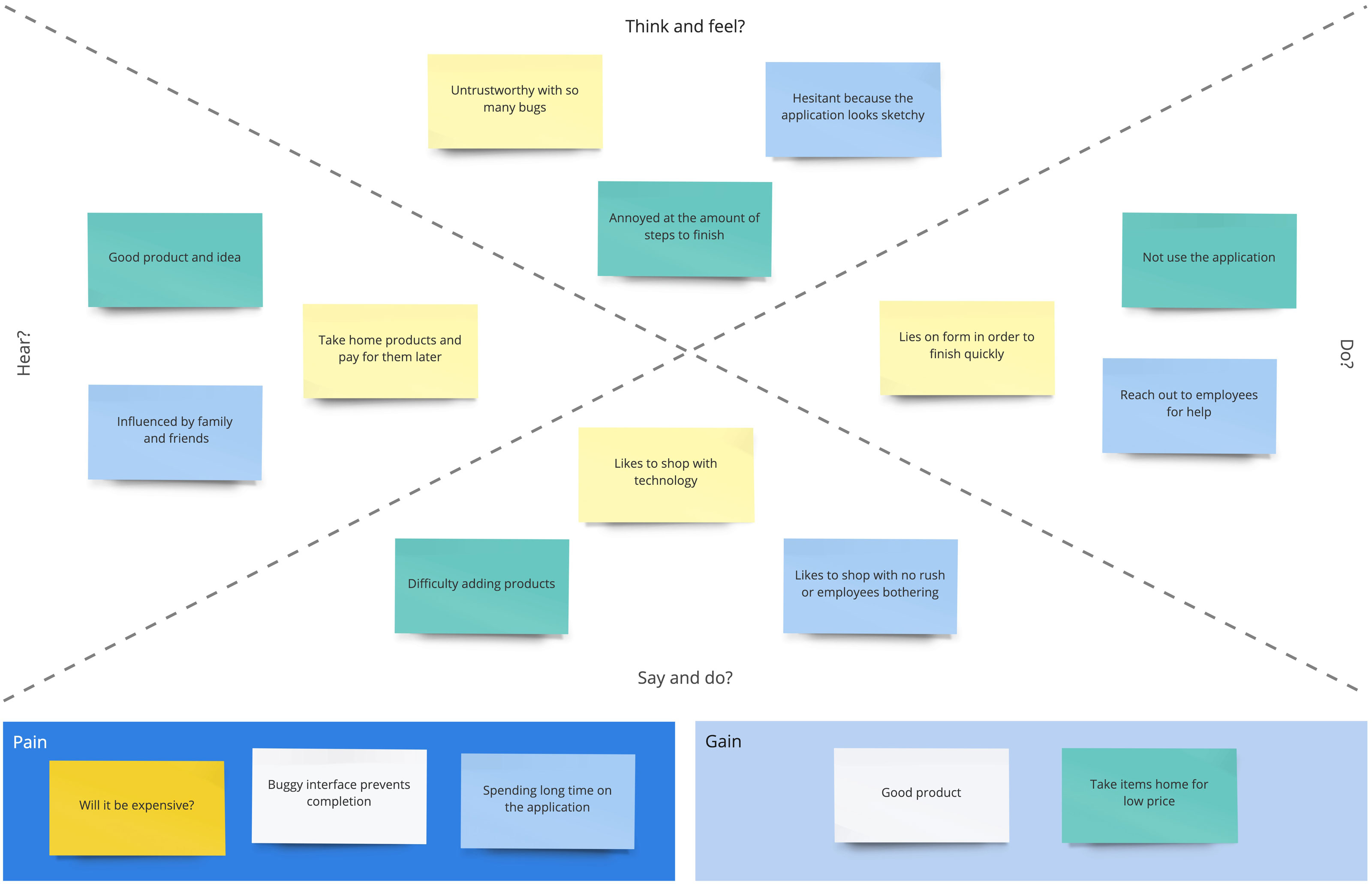
At initial glance, there were many identifiable issues such as bugs, high bounce rates, stale design, excessive amount of steps, etc. The tools/methods used to identify these issues were Google Analytics, user research forms, empathy maps, competitor research and manual QA sessions.
Google Analytics User Flow

User Empathy Map
Structure
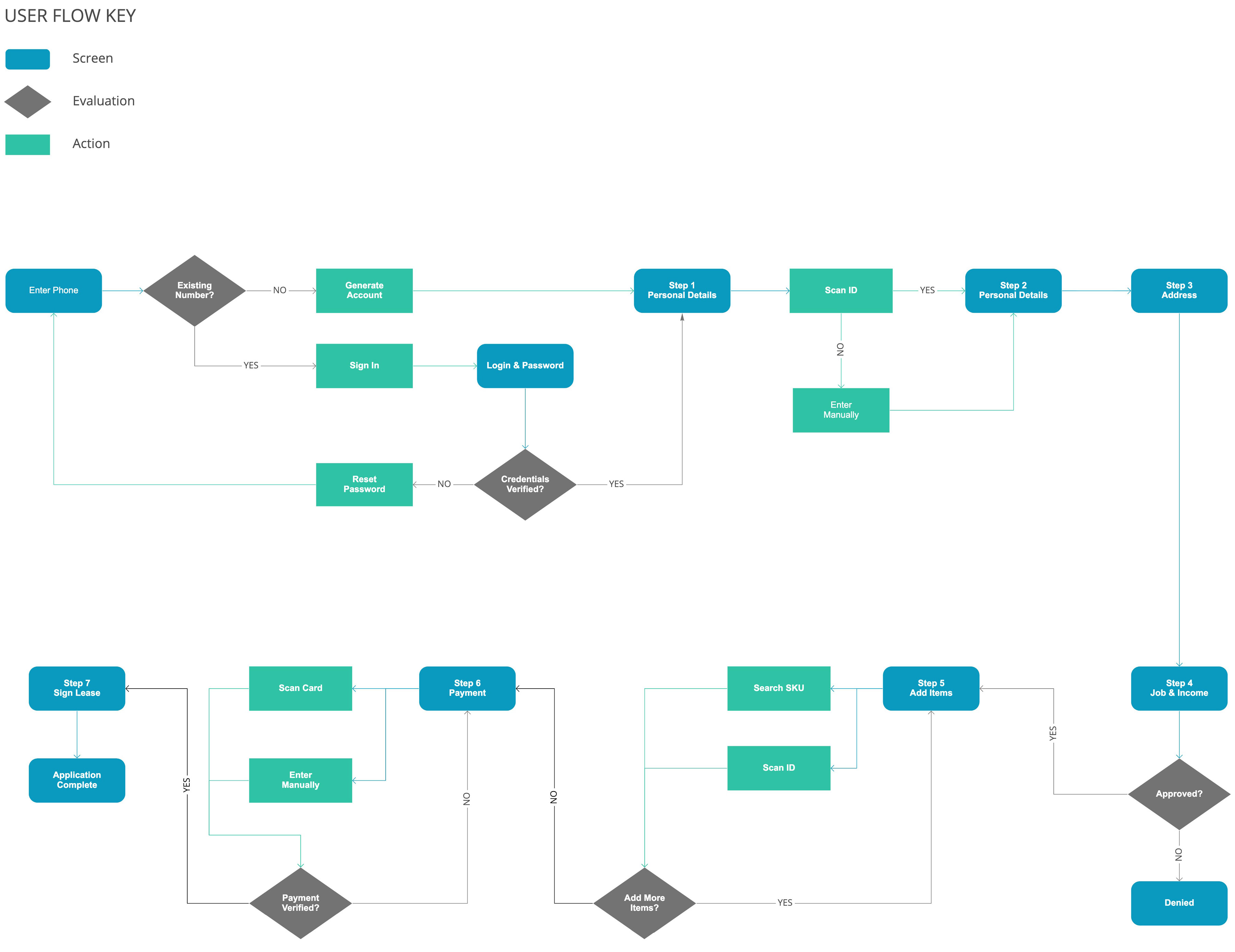
After determining the scope of the project through research and sketches we were able to consolidate fields & sections from the previous version of the application. User flows were generated based off of the new features that would expedite the time it takes to complete the application.
Old ISPM Optimization
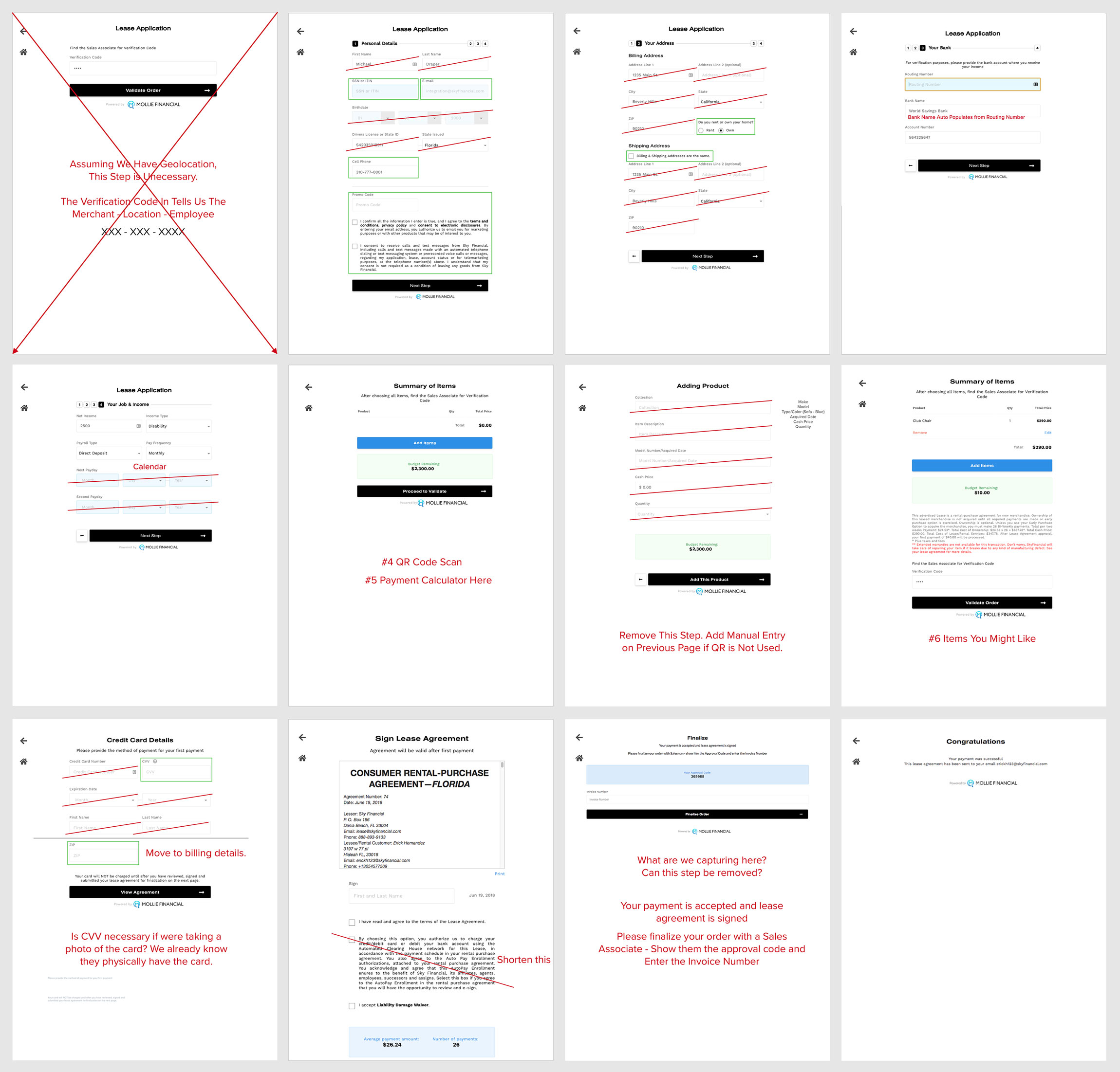
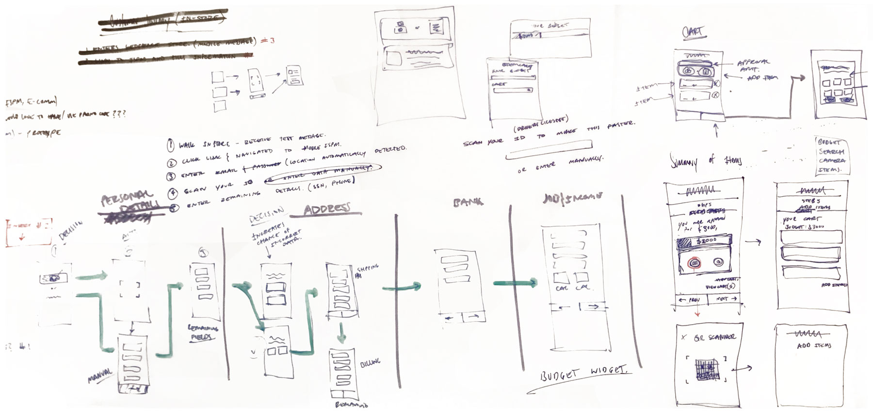
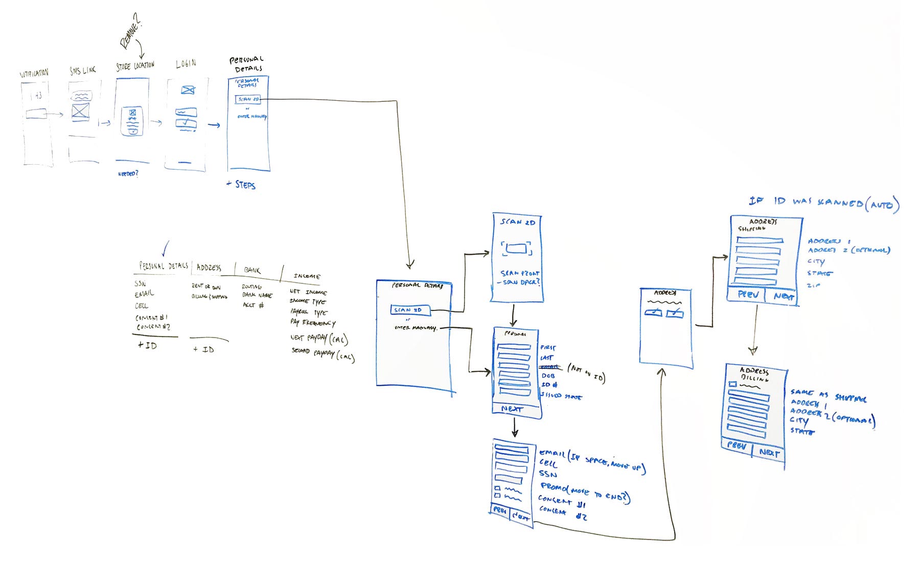
Sketches are a major part in my process as they allow me to quickly generate and document ideas. The sketches also expose inconsistencies as well as confirm whether or not these ideas are viable.
Concept Sketch
Field Dependancy Sketch
Design & Prototype
Wireframes and high fidelity prototypes allowed key stakehoders to come to a common consensus on the final design for implementation.
