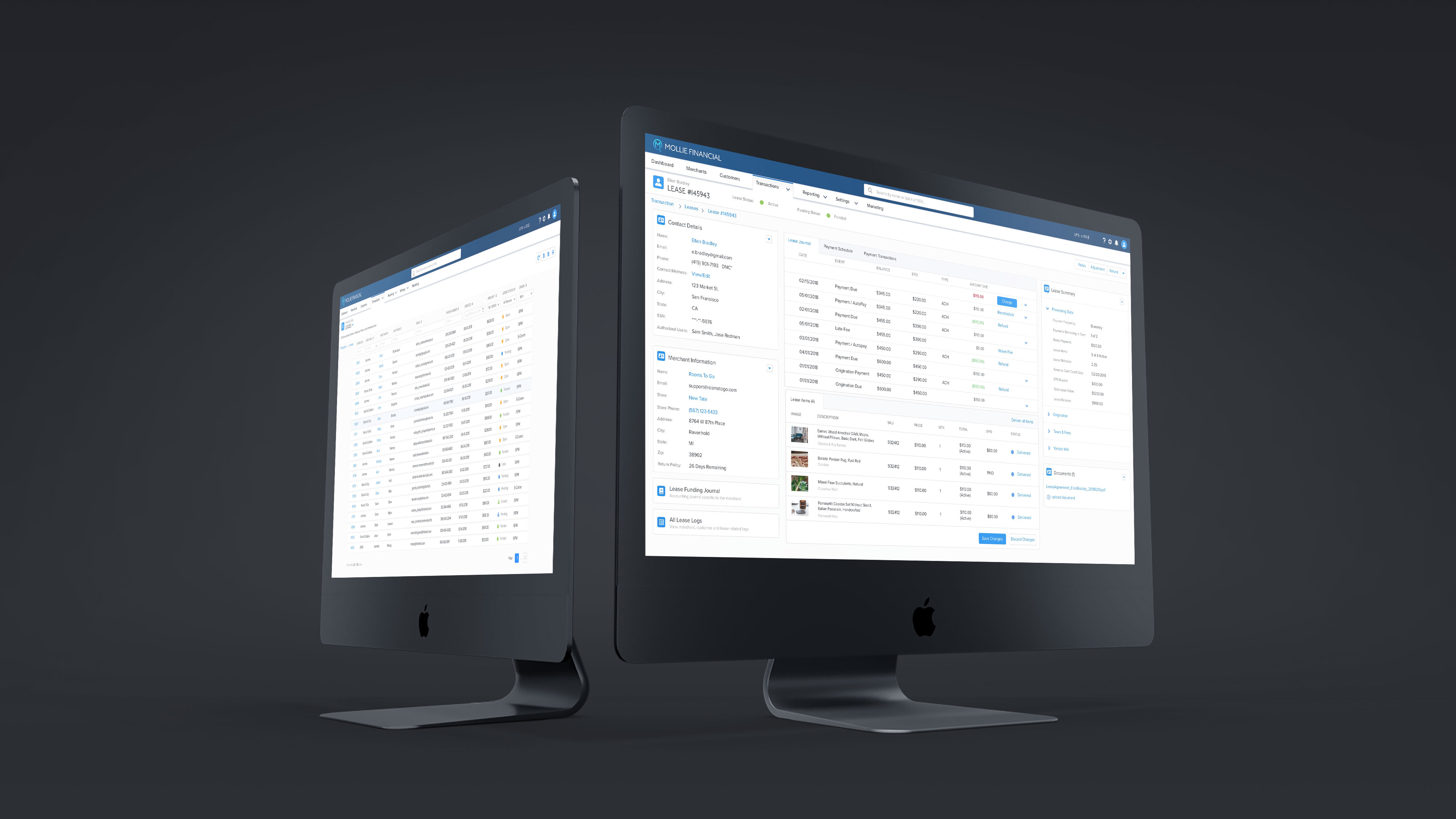
LeadConduit - ActiveProspect
ActiveProspect's LeadConduit software is a real-time lead optimization platform that allows users to take action on their leads by customizing lead flows, enhancing leads with additional data, filter and reject leads, and deliver it all straight to their CRM's. This project focuses on a navbar and information architecture redesign.
Role: UI/UX Designer
Tools: Sketch, Photoshop, HTML, CSS, JavaScript, Flinto, Invision
Problem
Users are having a hard time understanding where to go and what to do in the LeadConduit application. Additionally, there are also user flows that live outside of the application in other products offered by ActiveProspect.
Navigation Before Redesign

User Feedback
With the support of a Product Owner(Jon Perkins), we reached out to several clients to identify frustrations, painpoints, opportunities, and insights.
User Feedback Participants

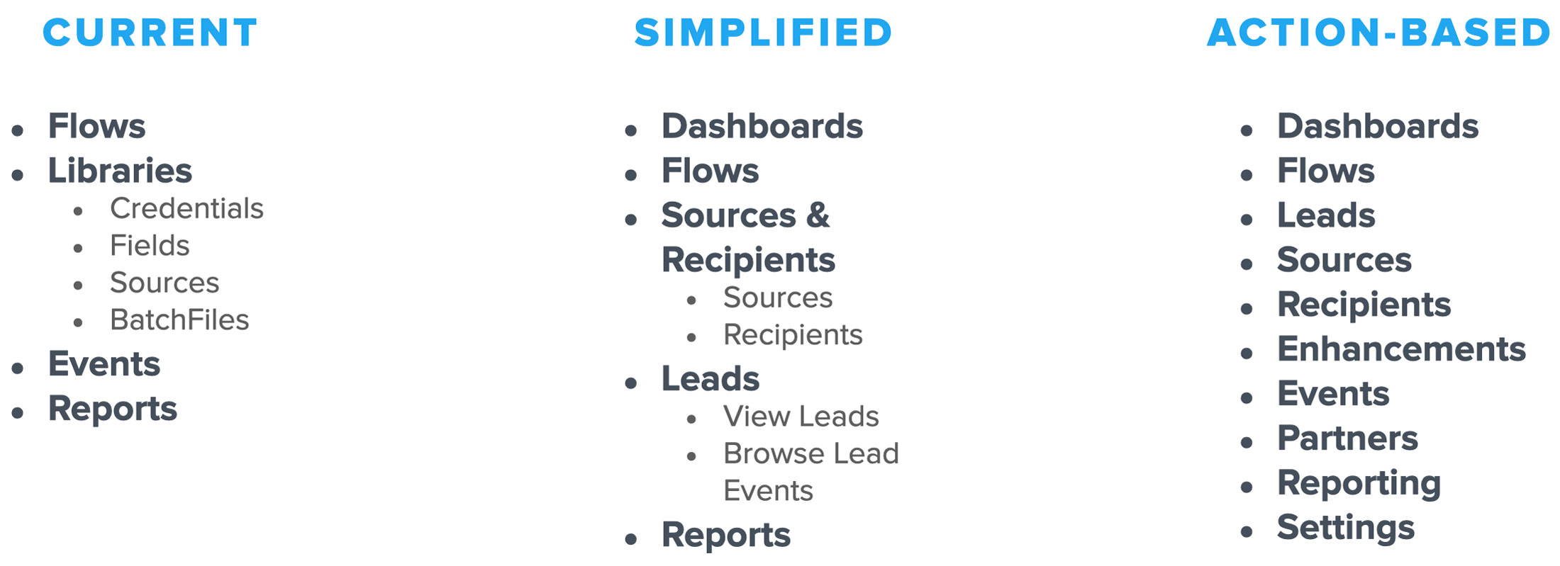
The initial round of feedback allowed us to find mental models & use cases that our research participants had about our existing navigation. We then generated two new variations of our navigation based off aggregate findings.
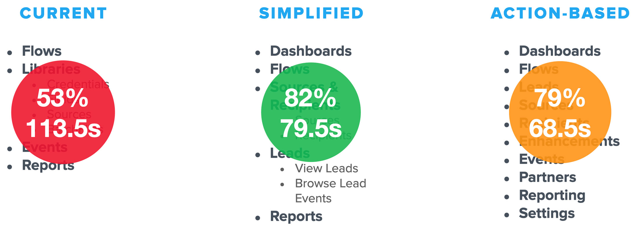
Current Navigation Structure & Two New Variations
Research
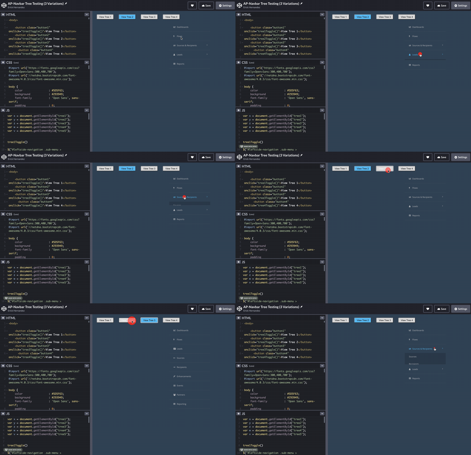
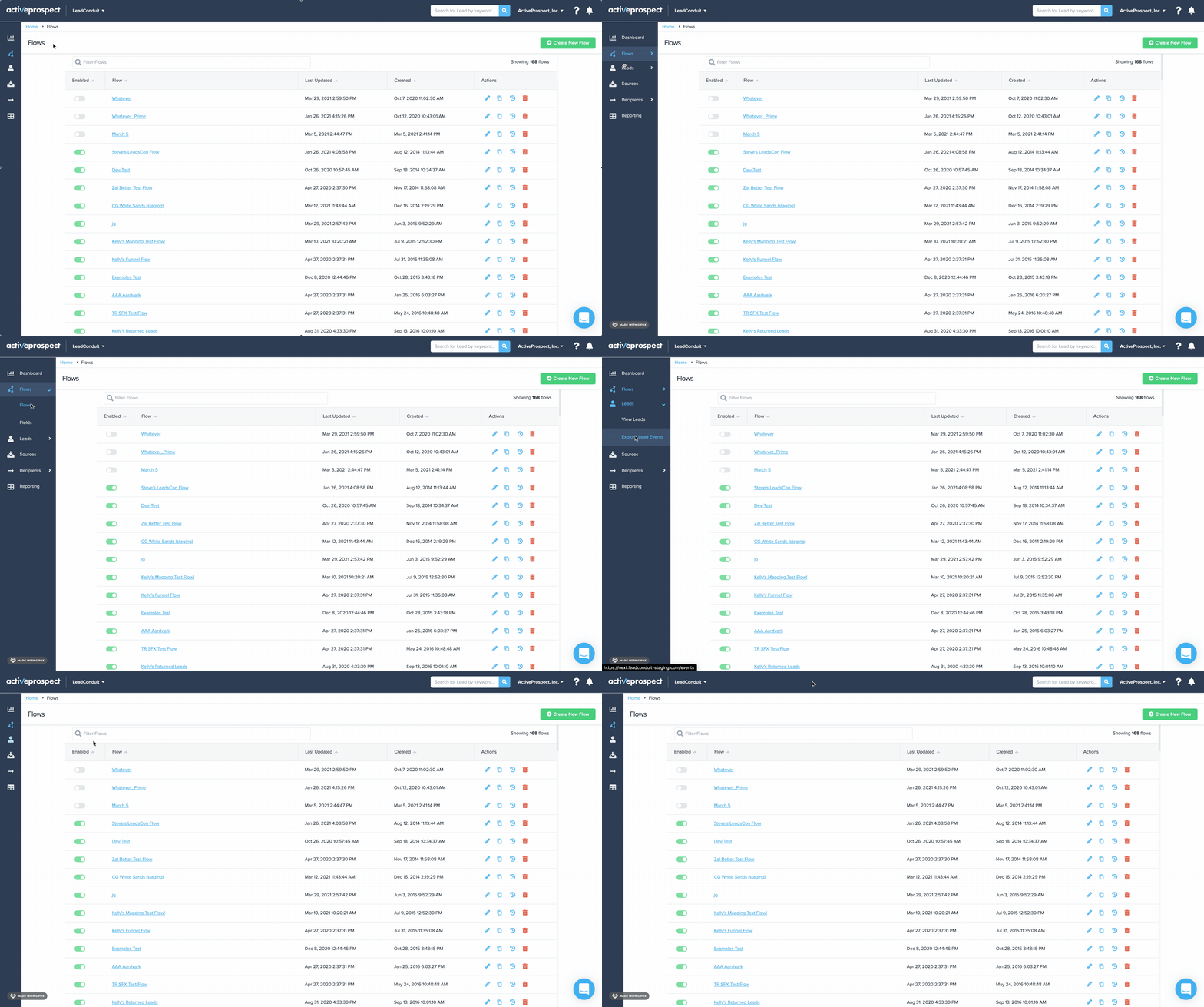
Tree testing is a usability technique for evaluating the findability of topics in your navigation. I coded all three nav variations within Codepen and re-scheduled calls with the research participants so that they can physically interact with the new options.
Coded Nav Tree Prototypes View On Codepen
We asked particpants a series of questions in order to measure time to target and success rate as they interacted with all three variations in Codepen. The goal was to learn the following:
What information do users want to see at the top level?
How can this information best be organized and structured?
Does the order/terminology of the content impact the time it takes to find/accomplish users goal?
Do users know where to go to accomplish their goals and how to get there?
Tree Test Responses
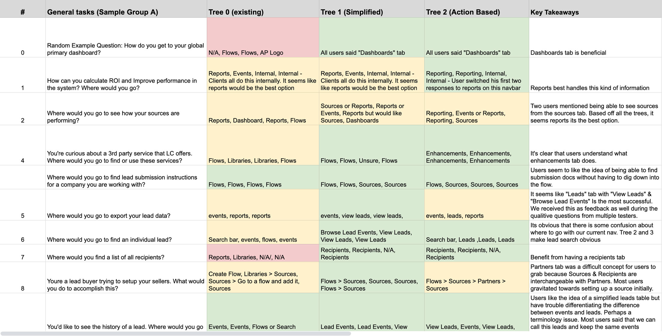
Once we completed the research, we compiled the aggregate data and found that both of the new variations yielded very similar results. The simplified version had an 82% success rate and an average of 79.5 total seconds for time to target. The action-based nav had a 79% success rate and a 68.5 time to target average.
Research Results
Key Findings
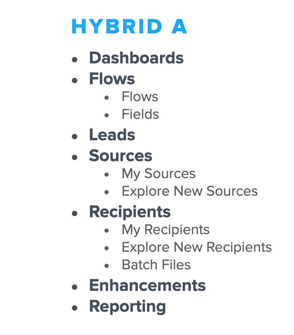
Although we had two new variations that yielded better results than the existing nav, we considered the key pieces of information that we're documented after speaking to the particpants. These discoveries of information led us to develop a 4th variation.
Too many options caused confusion. We want to avoid having navigation like our competitors
Lead centric mental model instead of events.
Users expect more from a sources and recipients tab than what is currently available.
Testing suggested that batch files & fields didn’t deserve a top level.
Confusion with “Partners” tab as the terms “Srcs, Recipients, Partners” are interchangeable
Navbar Variation 4 (Hybrid)
Design
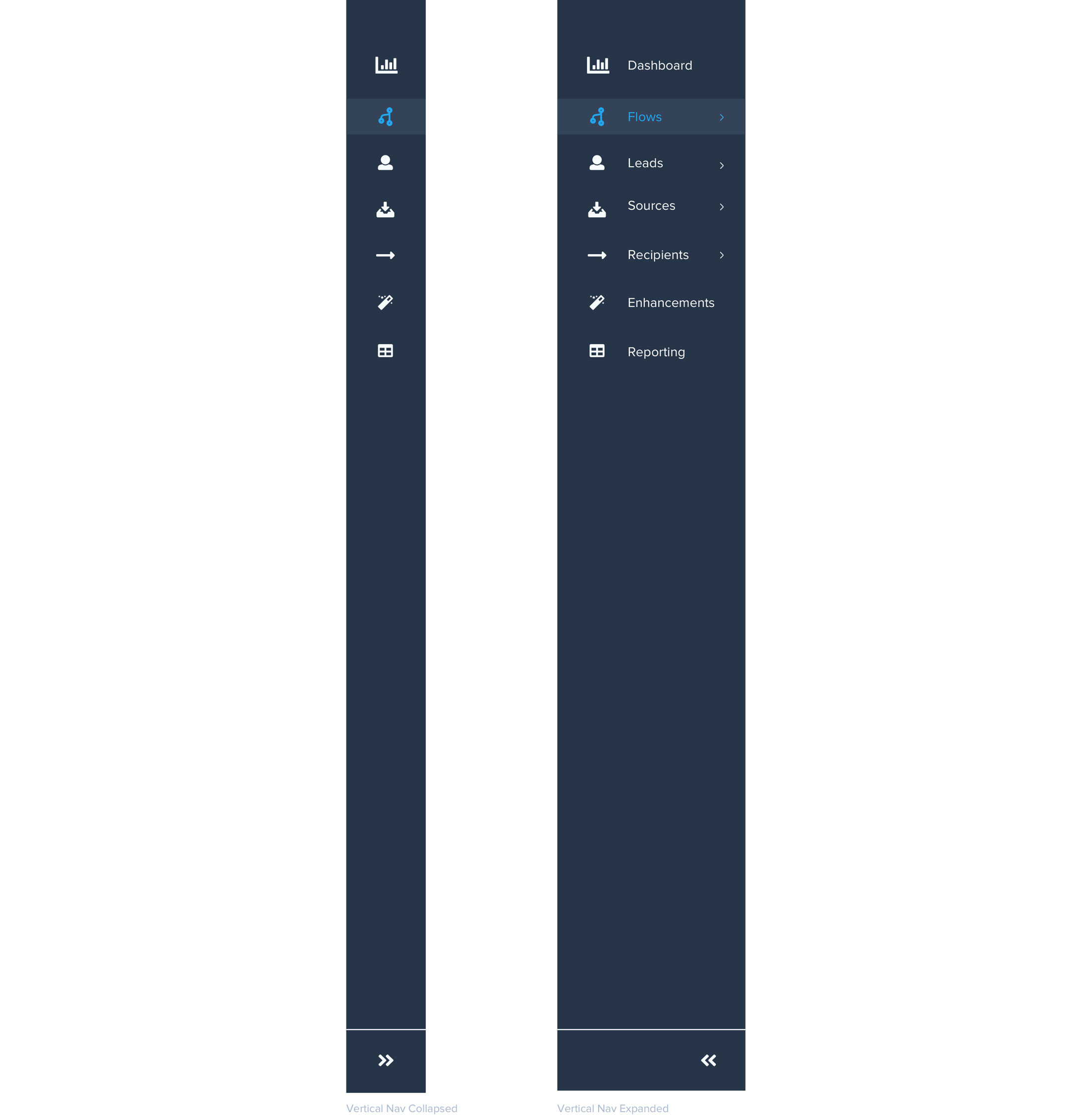
There are several obvious differences between the old and new designs. The navigation bar now contains a horizontal top bar which is comprised of global actions that are applicable across all platform products (e.g. Switch Products, account management, lead search, etc.) while the vertical nav is unique to the product that the user is currently in.
Final Navbar Redesign
Horizontal Top Navbar After Redesign

Vertical Side Navbar After Redesign
LeadConduit Navbar Dashboard Mockup
